easyJet APP

↓ Friction

Simplified booking & check-in flows

↑ Completion

Improved checkout through flow optimisation

↑ Engagement

Increased interaction with key features & upsells

↓ Drop-off

Optimised critical steps in the conversion funnel


Over the course of my work on the easyJet app, I contributed to a series of improvements and new features that made the experience smoother and more intuitive for travelers, while staying tightly aligned with business goals.

Every iteration was grounded in user insights and data, with a strong focus on usability, accessibility, and seamless interactions that reduced friction in booking and day-of-travel tasks.

Working closely with product managers, engineers, and analysts, I helped shape and roll out a scalable design system that brought consistency to the app and sped up how quickly we could design and ship new functionality. Through research, A/B testing, and behavioral analytics, I refined key flows in the booking and post-booking journey, improving engagement, supporting higher completion rates, and contributing to increases in ancillary revenue and customer satisfaction.

Process

01 Research

Interviews, analytics, usability testing

02 Define

Clear problems, priorities, constraints

03 Design

Rapid exploration + early engineering input

04 Validate

A/B testing, prototypes, real users

05 Iterate

Trade-offs based on impact vs effort

06 Launch

Measure, learn, refine

What changed

  • Context-driven homepage - adapts based on travel stage (planning vs flying)
  • Reduced friction - key actions (boarding pass, check-in) surfaced instantly
  • Modular system - scalable, personalized content blocks
  • Cleaner hierarchy - less noise, faster decisions
  • Performance-first design - optimized for real-world travel conditions

“Designing for travel means designing for stress, speed, and context. The right information at the right moment makes all the difference.”

Our design decisions were always tied to measurable outcomes: optimizing conversion funnels, reducing drop-off at critical steps, and creating intuitive, well-timed upsell opportunities that felt helpful rather than intrusive.

Among the many initiatives I worked on, one project in particular stood out for its complexity, its impact on travelers, and its importance to the business.


SUMMARY

As part of my role at easyJet, I led the homepage redesign to create a more intuitive, engaging, and conversion-driven experience for travelers. The existing homepage lacked personalization, clear user pathways, and effective prioritization of key actions. The goal was to simplify navigation, improve content hierarchy, and enhance usability, ensuring users could easily book flights, manage trips, and access important travel information. This redesign was a strategic initiative aimed at aligning business goals with user needs, increasing engagement, boosting conversion rates, and driving ancillary revenue through better feature discoverability.

CHALLENGES

Balancing simplicity with functionality while keeping essential features accessible. Designing for diverse user needs from first-time users to frequent travellers while maintaining fast performance and seamless cross-platform consistency. At the same time, integrating revenue and driving elements without compromising the user experience.

Project Goals
  • Enhance usability & navigation Make key actions intuitive and easy to access.
  • Improve information hierarchy Surface the most relevant content based on user needs.
  • Increase personalization Highlight trips, offers, and updates at a glance.
  • Streamline the interface Reduce clutter and optimise layout.
  • Boost engagement & conversions Encourage upsell interactions.
  • Ensure accessibility Design aligned with WCAG standards.
  • Build a scalable framework Support future features and growth.
  • Align with business goals Drive revenue while staying user-first.

Research Methods
  • User interviews Insights from frequent travellers.
  • Competitor analysis Benchmarking top travel apps.
  • A/B testing Comparing homepage variations.
  • Prototype testing Validating early designs.
  • Usability testing Identifying friction points.
  • Analytics review Tracking performance metrics.

CASE STUDY


In this case study, I'll walk through that project in detail and share how it improved both the customer experience and the business.

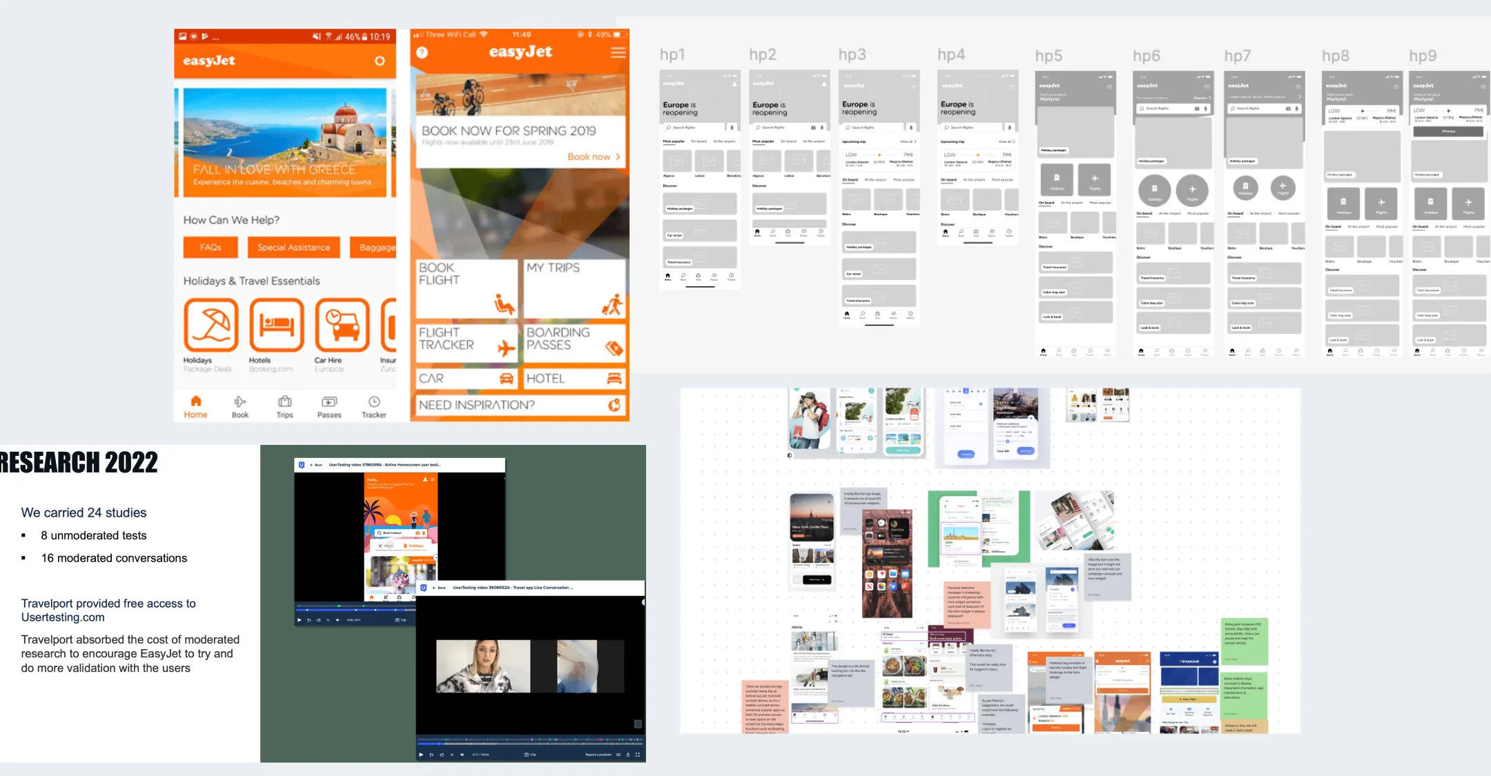
When I joined the easyJet team, one thing quickly became clear that our homepage experience wasn't living up to the expectations of modern travelers. It felt cluttered, lacked personalization, and didn't provide the right information at the right time especially on Adnroid. Passengers were frequently hunting for their boarding passes, struggling to find upcoming flight details, or feeling disconnected from their journey.

Before jumping into solutions, I took a step back to truly understand what our users needed. Through usability testing, customer feedback, and data analysis, we uncovered key frustrations. Travelers wanted instant access to essential information, boarding passes, flight updates, and booking details without unnecessary distractions. Our research also highlighted that many users opened the app frequently in the days leading up to their trip, yet the experience didn't adapt to their journey stage. To ensure alignment between user needs and business goals, I conducted a Design Studio workshop with stakeholders.
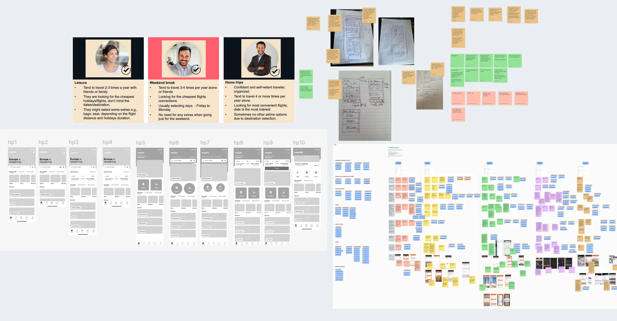
This collaborative session helped us define key requirements, prioritize functionalities, and explore potential solutions while keeping both user experience and commercial objectives in mind. By bringing together different perspectives, we ensured that the redesign would not only enhance usability but also drive engagement and business value.


Quick Flow draft


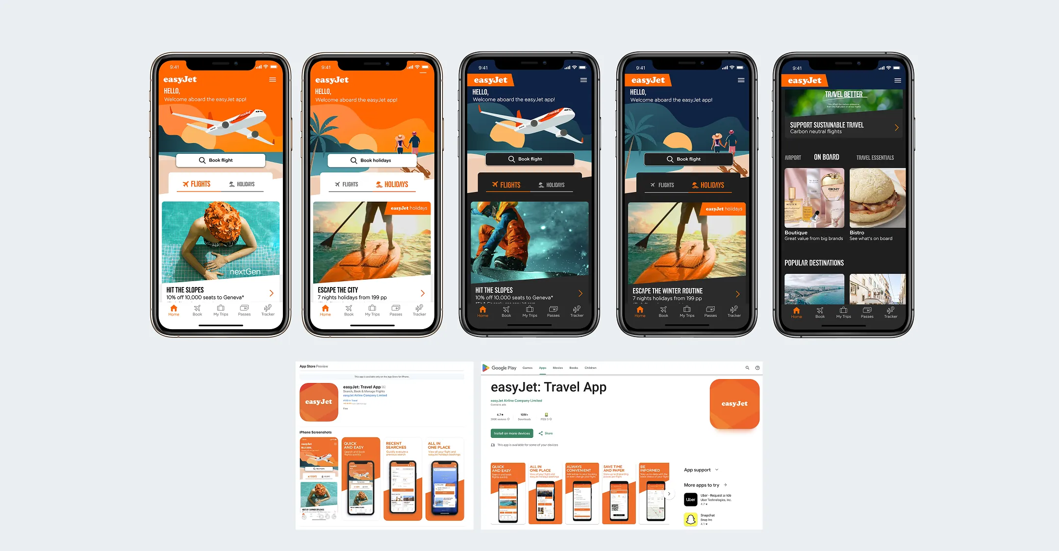
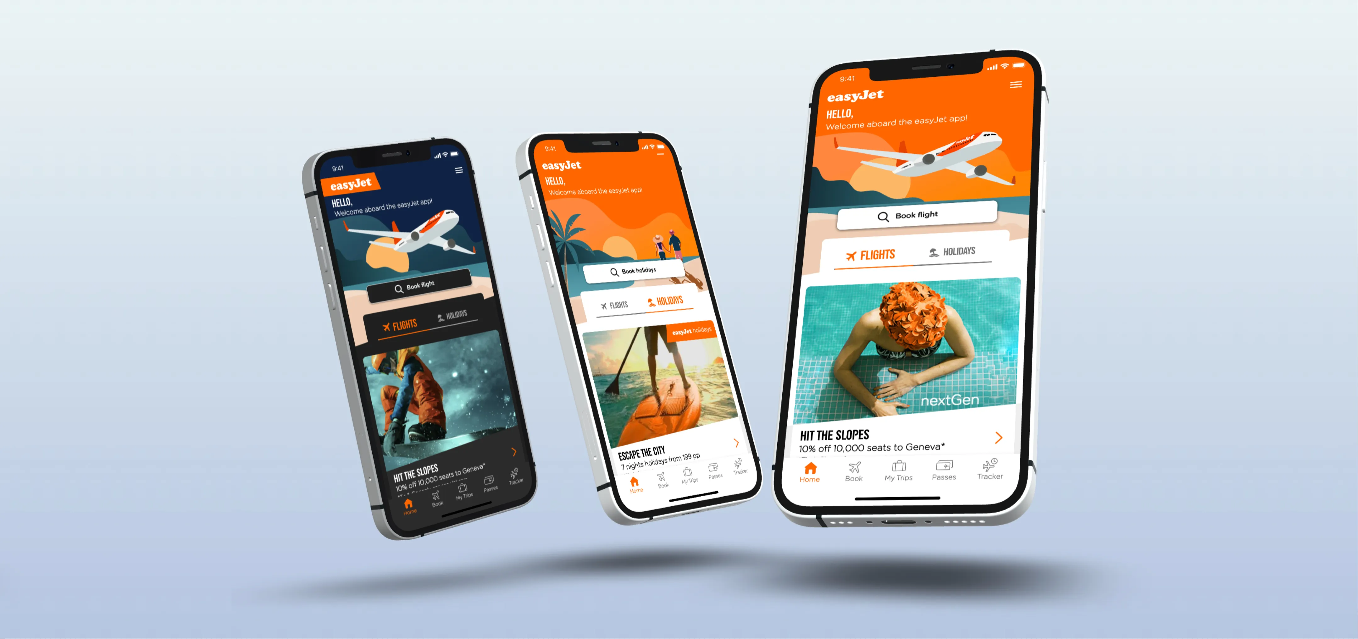
With these insights in mind, I set out to redesign the homepage with a clear goal: to make travel effortless. We streamlined the interface, prioritizing real-time, dynamic content. If a passenger had an upcoming flight, that became the focal point, boarding passes, departure times, and gate updates surfaced immediately. If they were planning a trip, the homepage seamlessly shifted to showcase relevant bookings, offers, and inspiration.

To enhance clarity and usability, we reduced cognitive load by refining navigation, simplifying language, and ensuring that every piece of information served a purpose. No unnecessary friction - just the right details at the right time.


I also introduced a more modular layout, allowing personalization based on user behavior. Frequent flyers saw different content than occasional travelers, creating a more tailored experience. By leveraging data insights, we ensured that interactions felt intuitive and relevant, reducing the effort required to manage travel plans.

To bring all of this to life, I worked closely with developers to ensure smooth interactions, optimized animations, and fast-loading components, enhancing both usability and performance across devices.
Quick Flow draft


Redesigning the easyJet homepage was more than just a UI refresh, it was a deep dive into how travelers think, behave, and interact with digital products under real-world pressure. It taught me how much context, speed, and clarity matter when people are stressed, short on time, and relying on a single screen to feel in control of their journey.


    • Context matters: Travelers need different things at different moments. Someone checking in cares about boarding passes and live updates, while someone browsing for a future trip wants ideas and offers. Designing around those moments reduced friction and kept people moving.

    • Simplicity is hard: Adding features is easy; choosing what to remove is the real work. Stripping away noise, showing only what's essential, and reducing decision fatigue made the experience feel calmer and more intuitive.

    • Speed is part of UX: A page that looks great but loads slowly still fails, especially in an airport queue. Treating performance as a core design concern and working closely with developers helped the homepage stay fast, even on weaker connections.

    • Relevance beats generic: Frequent flyers and occasional travelers don't have the same priorities. Using behavior and context to adapt the homepage made it feel more useful and less “one-size-fits-all.”

    • Good work is cross-team work: This project only came together because design, development, product, and data were aligned. Agreeing on goals early, testing ideas together, and iterating on real usage made the end result much stronger.

    • User feedback is the real test: The most meaningful signal came after launch, when travelers said they felt more in control and less stressed. That showed the redesign wasn’t just cosmetic, it actually made their journey easier.


Quick Flow draft

If you like what you see and want to chat please contact me!

Email Me